In today's eCommerce market there is a focus on hyper-efficiency and smart capital management. The question we are hearing a lot is, "What can I do to increase my sales and run my business more efficiently without blowing up my budget?"
Drew Himmel, founder and a CEO of Fireside Digital, brings over 15 years of experience with digital strategies, email marketing, and conversion rate optimization (CRO) and was kind enough to share with us his top 7 strategies to accomplish this goal.
Listen on Spotify
First, a bit about Fireside: Founded in 2007 during a recession, Fireside is no stranger to the challenges of uncertain economies. They were born from efficiency and provide that guidance to clients even today. In the beginning it was just Drew working from his living room couch. But, over time he grew the business from local and regional to national. Today they work with some very large clients: Home Depot, the Los Angeles Chargers (before and during their move the Las Vegas), MLB teams, and everything in between. Check out their portfolio here. After testing the digital marketing waters, they started to focus on eCommerce clients which allowed them to use so much more data leverage those inputs to optimize for CRO.
What is Conversion Rate Optimization?
Conversion Rate Optimization (CRO) is the systematic process of increasing the percentage of website visitors that result in conversions. That's the simple definition. When you dig into it, though, the process is often complex and involves a lot of moving parts.
From Drew: You want to look at that holistic user experience and all the various touch points available to users from the time they first land on your homepage to when they check out on your cart. It's no longer as simple as, "Oh, change the button from green to blue, and it does this." You really need to understand how to merchandise the site, how to lay out your homepage, navigation, product pages, site search, etc. It now encompasses your entire user experience even post-purchase.
CRO is a really hot topic. We hear it a lot from our customers and our clients. They're in a situation where they don't have growth capital, but they obviously still want to grow. So how do they do that?
The costs of acquisition for new customers has gone up and they're looking internally to do better with their operations to try to see if they can extract better revenue.
Why Focus on Conversion Rate Optimization?
There was actually a local agency that I thought kind of coined the term CRO, maybe they the first, but they spent a lot of time with marketing experiments around it. It was all through a data analytics lens. They would do big landing page experiments back in like the early 2010s for huge companies like Expedia. And when tools like Shopify this become a lot easier for brands to start running these experiments themselves without having data scientists. You started to see it really take off.
Then, more recently, with the iOS 14.5 and on updates and other things affecting tracking, the cost of acquiring customers became increasingly more expensive and difficult. The market started asking, "Well, what can we do?" That's where CRO started to become a lot more commonplace and even essential in eCommerce markets. But most companies didn't have an internal infrastructure to implement the methodology needed to capitalize on it. That's where companies like Fireside and Finch come in.
The tips I'm about to share are from an eBook we put together called 7 Ways to Drive More
eCommerce Revenue Without Increasing Ad Spend - you can download that here. Let's go through them.
1. Optimize Your Checkout
We recently starting talking with the brand that was doing very well online, but they had a checkout experience where you have to give all of your contact information along with all of your payment information on the same page. That was preventing them from understanding their abandonment data. You want to make sure the checkout steps are very clear so you can figure out which parts are causing folks to drop out of the process.
We spend a ton of time and energy analyzing the data around checkouts and all of the different CTAs that you could actually use, etc. Then we focus on streamlining that process. For example, do you really need a customer's last name? Maybe you could just get by with collecting a first name. You want to at least experiment with those things and ultimately use something like a Google Optimize to be able to run a quick A/B test and find winners.
Optimizing your check out has to be the number one most critical element of improving CRO.
2. Create a Sense of Urgency in Your Shoppers
It's not a good thing when your shoppers feel like Black Friday always turns into Cyber Monday turns into Cyber Weekend turns into extended Black Friday Summer. This is something that we caution our clients against. As a brand, you want to be really authentic. And if your customers feel like your always trying to create a false sense of urgency, you lose authenticity with them. Is it the last chance or or not?
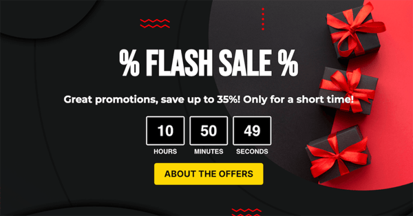
This is a good way to lose repeat business and get people to tune out from your message. You can't ignore customer lifetime value and the repeat purchasers. A better way to approach urgency is by implementing it into the checkout process.
We've even done things with running timers in the checkout showing how long the sale will last. But don't run the extension that expires the next day and then extends it again. Users are savvy enough to see through that. We do want to use that urgency to create an incentive - that's psychological behavior 101 - but I would caution that you make sure it's authentic as well.
Any time you're running promotions, just don't just have it on your homepage top banner, but also displayed on your product page and other places it makes sense throughout the user journey.
3. Encourage Customer Reviews
Reviews are so important. Some brands really understand this and spend all their energy, time and effort on it. And some just neglect it. But we do see a significant conversion lift when we focus our clients on obtaining reviews from their customers.

You'll want to incorporate them into the overall funnel and email flows for the post-purchase process. It should be a holistic strategy that feels natural to the customers. If you just have one or a few products with dozens of reviews and the other products on your site have none, that will look weird to customers. So make sure you're strategy incorporates all the SKUs you can.
Incorporate that into your customer service so that you can aggregate them as much as possible. And if you can get video reviews and testimonials, you'll be cooking with gas. There are lots of tools out there like Okendo and Junip that allow you to easily gather video reviews from customers.
Finally, if you're able to get video reviews, make sure you highlight them prominently on the product page. They are very powerful and you want people to know they're there.
4. Highlight BIG Discounts for Price-sensitive Shoppers
We see a huge lift in conversion when we show the old price strike out and then the discounted price. So, instead of saying 10% off of a $25 product, show what the original prices was with the strike there and then show them the new price at $22.50. People don't like to do math. This way they see what they're actually getting in the discount. It brings a lot of clarity.
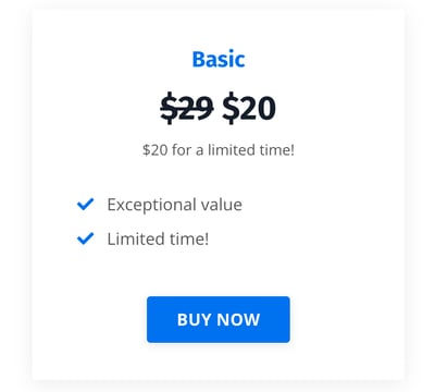
We're always about reducing points of friction. This is especially true as you get larger, more expensive products and larger discounts. The math becomes too complicated to do on the fly and people tune out.
In experiments on this we've seen a very dramatic difference in the overall conversion rate when your use the old price strike-out with the discounted price next to it. So, that's something really straightforward and easy to set up for eCommerce chops.
5. Display Real-time Availability of Products
You can resolve a lot of anxiety for your customers by displaying the inventory levels of products. Even if this is just a low/medium/high thing to start out, at least your letting them know some information. No one wants to go through a checkout process and then get an out-of-stock email. That's the worst experience you can provide a shopper.
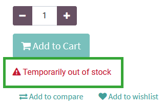
We have some clients that do exclusive drops. These are collaborations with artists and creator that they offer to VIPs or loyalty members. When the products arrive, they send a quick SMS to the group to let them know the exclusive products are in stock. This is the kind of thing you want to aim for - sharing the actual availability of the product in in real time.
6. Use Simple Product Card Design
What we mean by "product card design" is basically what is above the fold on your product pages. There are main components that are necessary. But the simpler you can make it to read and understand the basics, the better.
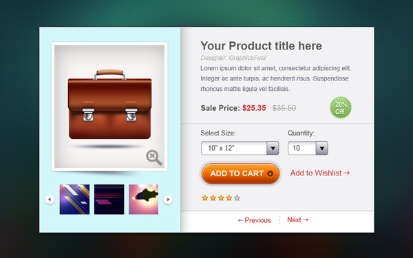
If done carelessly, it can be overwhelming for shoppers.
The main components of the product card:
- Headline: name of product, maybe some descriptors
- Product Image: should be from several angle, high quality
- Product Description: not too long, just what's necessary and important to the product
- Pricing Info: display any discounts here and make the current price clear
- Cart Button: should be obvious and distinct element
Consistency is very important here. Make sure you're displaying the same basic information for all of your SKUs across your site in a way that makes sense and connects the UX.
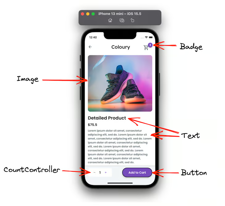
7. Pay Attention to Your Mobile Experience
You really have two different sites. You have the desktop version of your site, and you have the mobile version. And we have clients getting 60-70% of their total traffic coming from Mobile. So we always recommend designing mobile for fat thumbs. Make it very easy to click CTAs and navigate your mobile site. You want to reduce the amount of scrolling as much as possible.
 Source: LogRocket
Responsive design is a must nowadays, but it should go further than that. Don'e just design a site that can be responsive and look/work fine on a mobile devise. Design a sight that works as well, if not better, on mobile as it does on other screens.
Spend time to go through the mobile experience of your site yourself. You'll find things that need to be fixed very quickly.
ProTip: Create stickiness in the mobile experience. Make the "Add to Cart" button always present as users scroll the page so they don't have to scroll back up to find it. We saw one client get an instant conversion boost of .07% just from doing this.
There are very simple, easy ways to have a dramatic impact on conversions. Getting these things taken care of, will have massive impacts on your revenue numbers.


